
DESIGN NOTE: WHEN MATERIAL SETS THE TONE
- Viktoria Gilanyi

- Feb 26
- 1 min read
Updated: May 1
How choosing the right materials in interior design influences mood, tone, and overall atmosphere.

This one stopped me in my tracks.
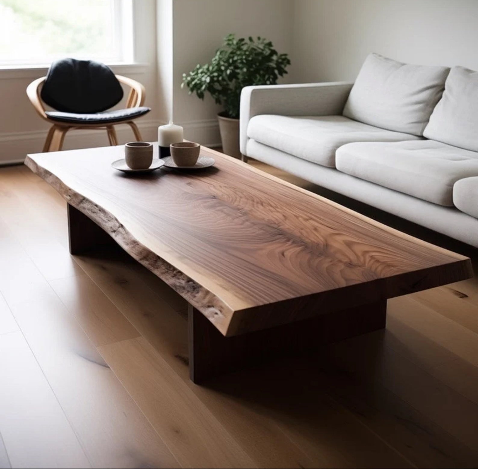
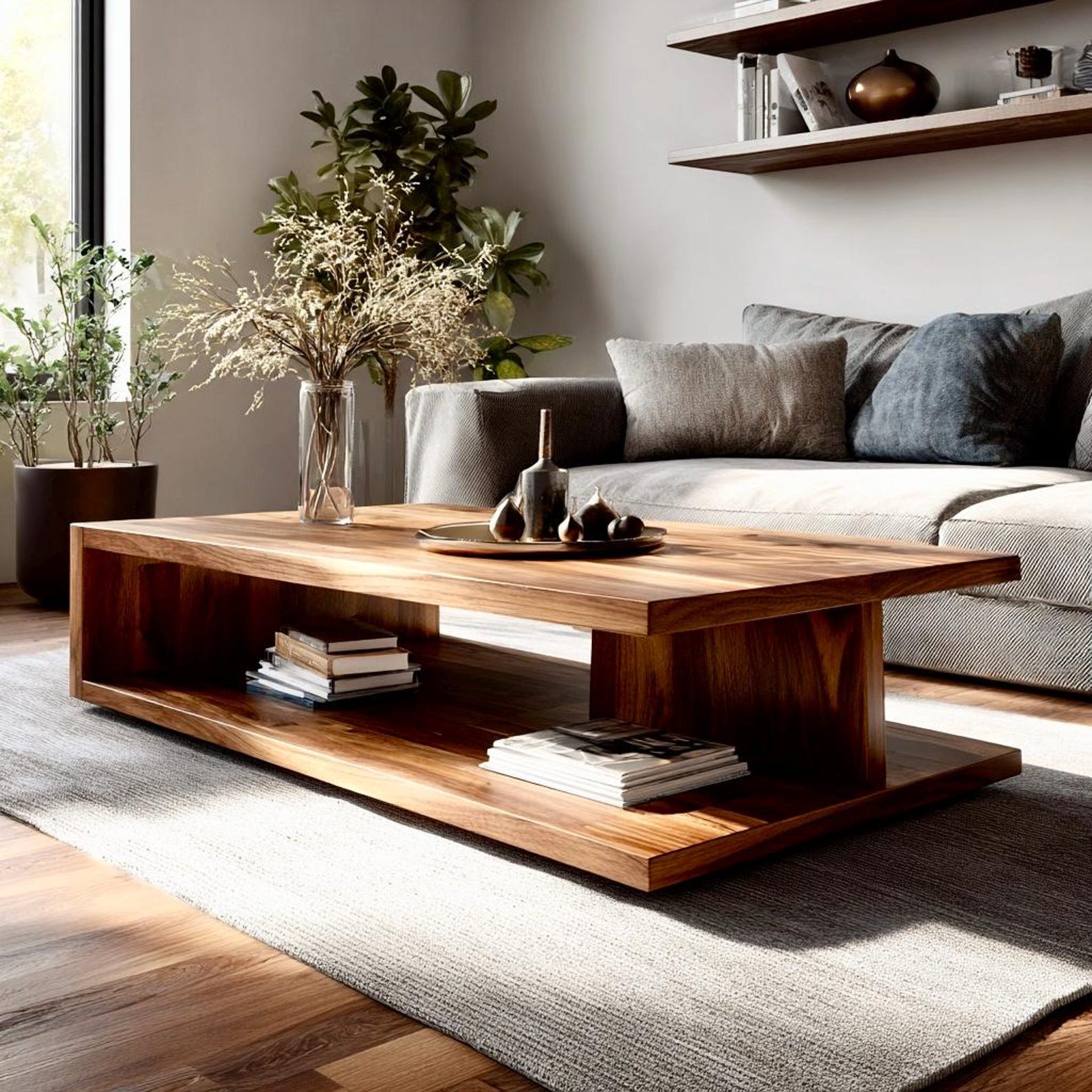
Not because it’s trendy, but because it feels almost geological in its presence.
The depth, the contrast, the quiet drama… materials like this set the tone long before furniture or lighting enter the conversation.
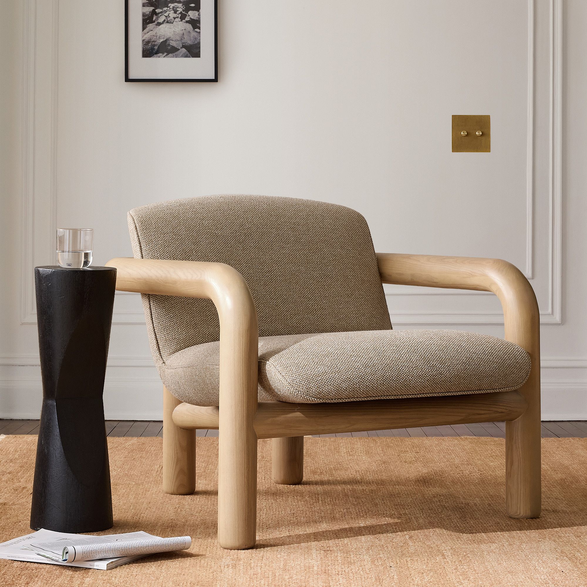
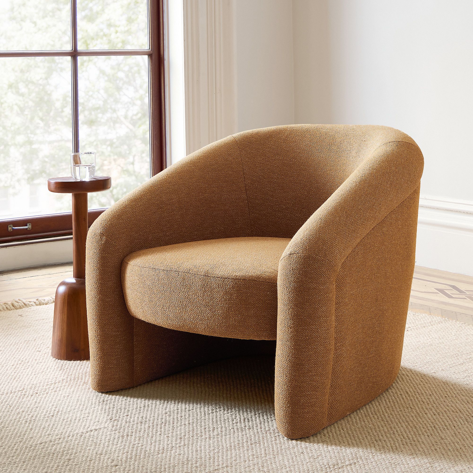
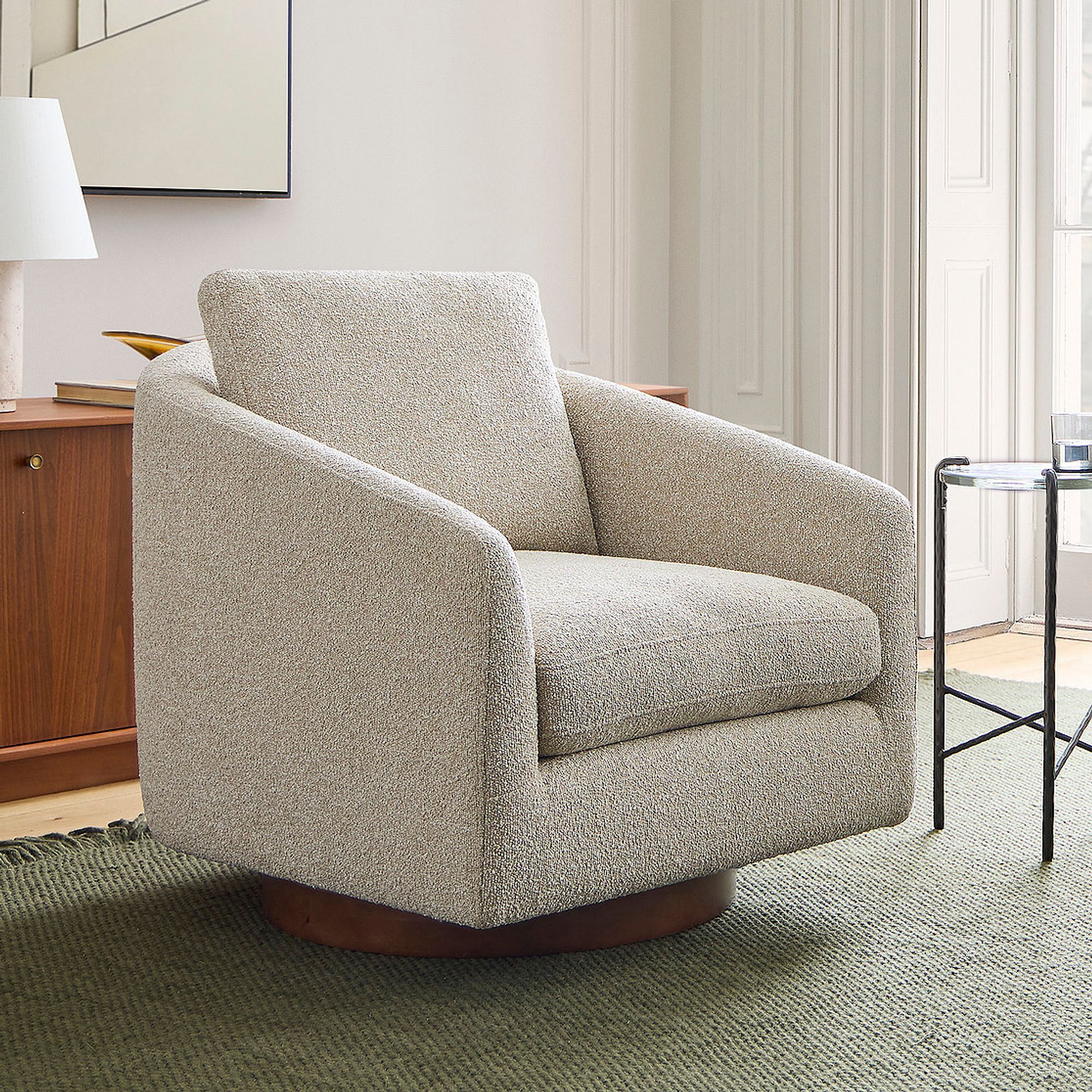
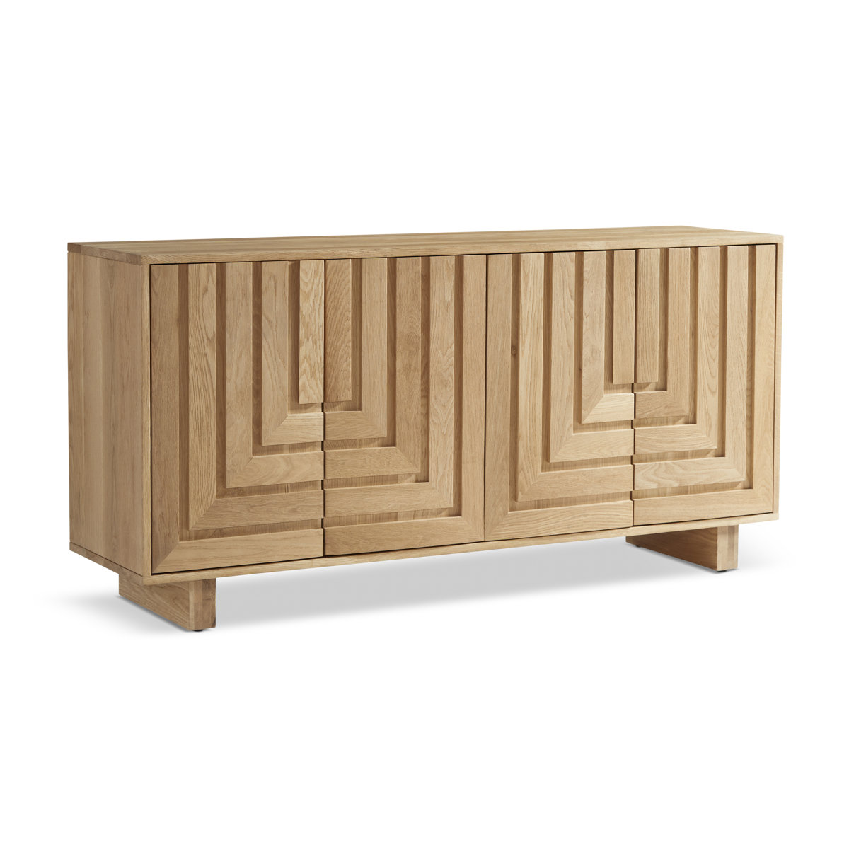
We often begin a project with layout and function — and rightly so. A space must work before it can feel good. But alongside those practical decisions, something quieter is happening. Our perception is forming.
We register texture, movement, contrast almost immediately. Before we consciously evaluate a room, we respond to it.
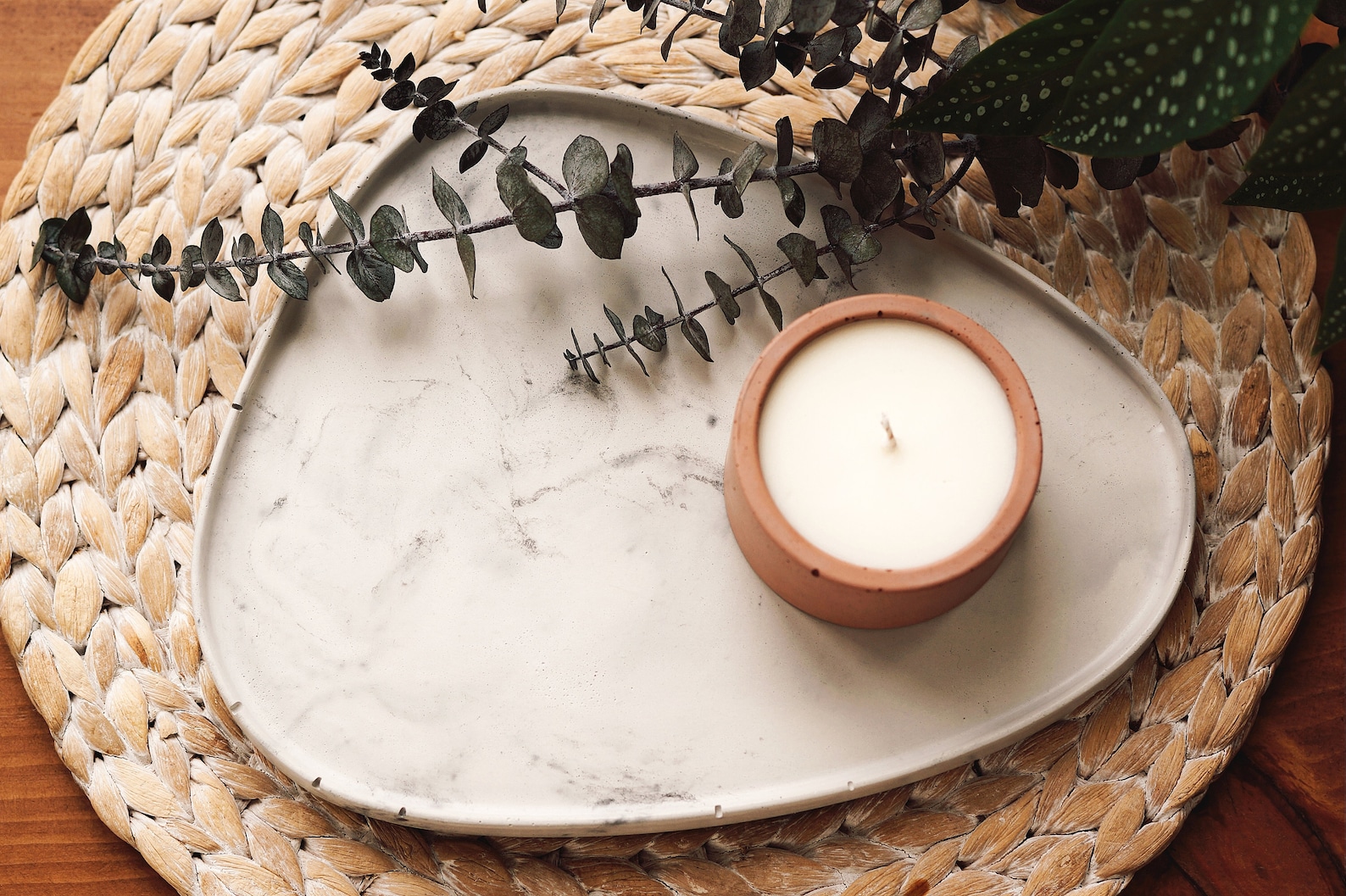
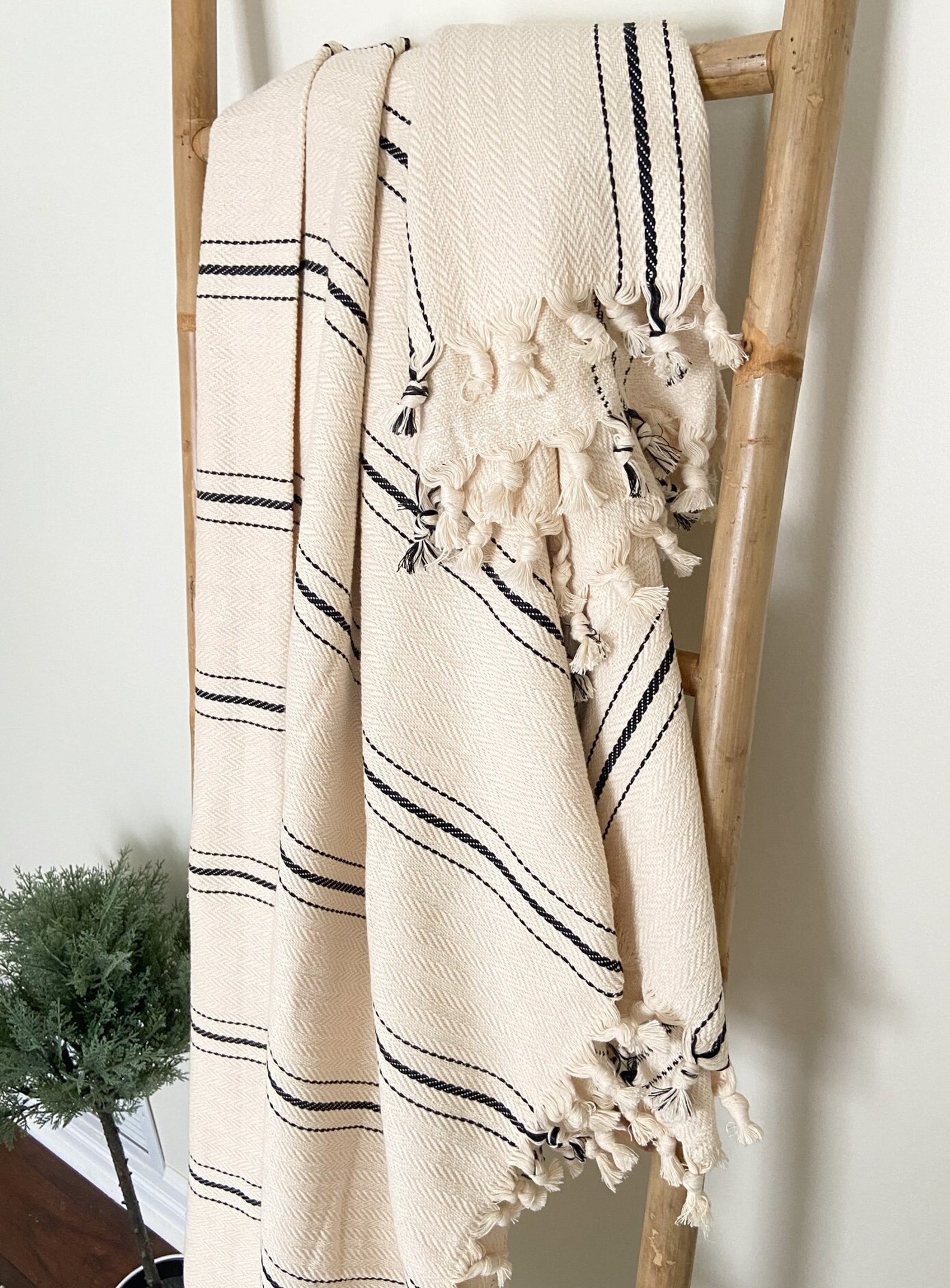
Whether a material is quarried from the earth or carefully engineered to echo it, what matters is the visual language it speaks. Variation. Depth. Irregularity. These are patterns our eyes recognize. They feel layered rather than flat, alive rather than repetitive.
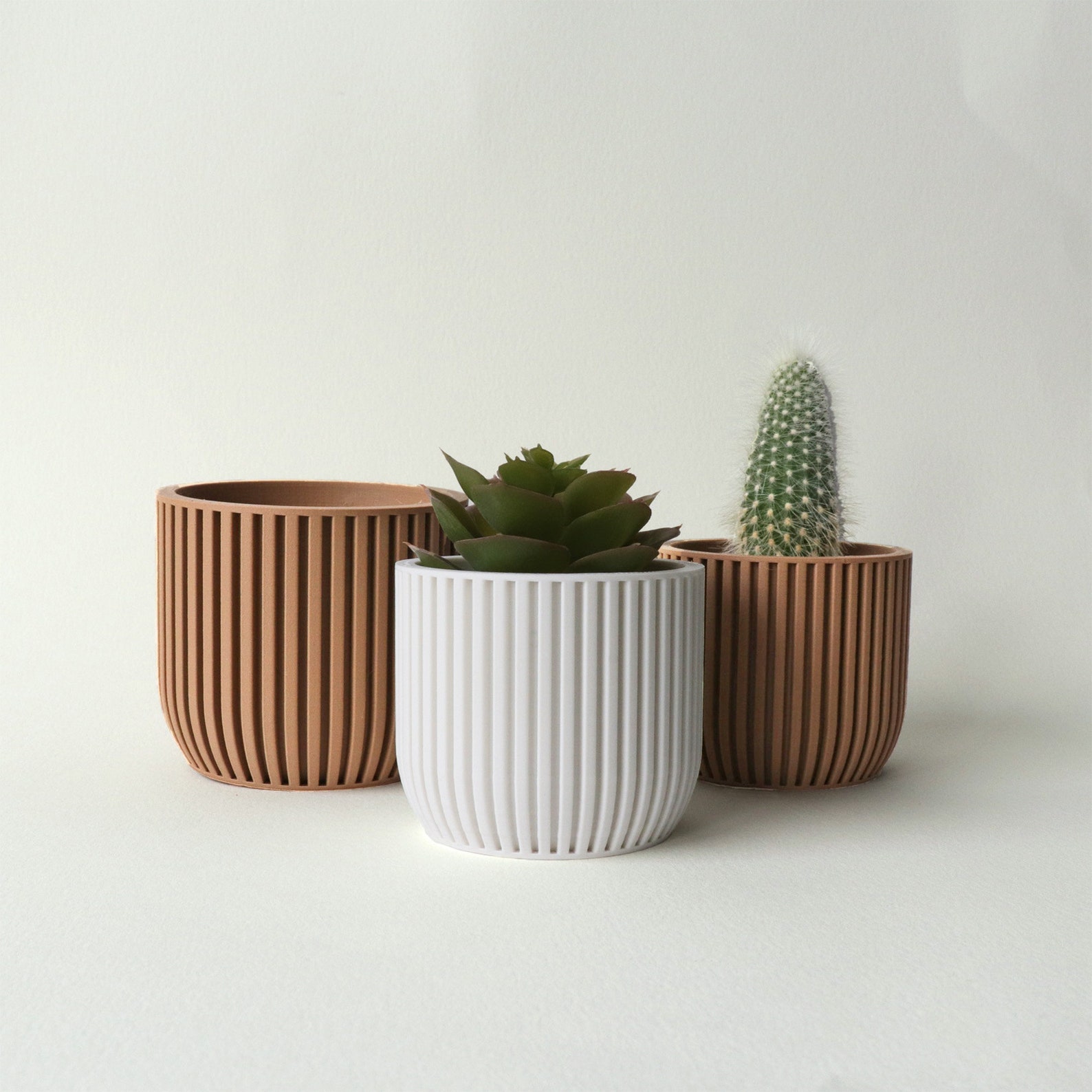
In smaller spaces especially, a material with this kind of presence can do something subtle but powerful: it carries visual weight. When one element holds that depth, the rest of the room doesn’t need to compete. It can breathe.
This is part of designing for people first — understanding how a space is experienced, not just how it functions.
So yes, it may read as a statement. But its real role is quieter than that: it grounds the room.
Material choices are never just aesthetic decisions - they shape how a space feels long before the details are complete.
ORIA Interiors offers considered, human-centred design rooted in how you live and experience your home.
Get in touch when you’re ready to design with intention.


Comments